

We’re bombarded with choices in every aspect of life, and the internet magnifies this issue. Today’s websites offer countless choices for clothes, music, movies, gadgets, jobs, courses, dating prospects, and so on. The possibilities seem endless, and that’s great—right? Who doesn’t want all the choices in the world available with just a click? Well, maybe not as many people as we think. There’s a growing issue known as the “paradox of choice” that is causing unintended effects for consumers and businesses online.
To begin, let’s define what the paradox of choice actually is at its core.
What is the Paradox of Choice?
The paradox of choice, also sometimes known as choice overload, posits that having lots and lots of choices available does not, in fact, lead to greater freedom and customer satisfaction, but less.
From The Decision Lab: “…having an abundance of options actually requires more effort to make a decision and can leave us feeling unsatisfied with our choice[…]When the number of choices increases, so does the difficulty of knowing what is best.”
Therefore, having an abundance of choices can result in the individual being unhappy with their final choice, or worse, not making a choice at all and walking away emptyhanded. And that’s the last thing you want for your business!

Why Having Too Many Options is Bad for Your Website
From our experience as digital marketers, we have had repeated conversations with different clients about the issue of giving website visitors abundant options. From the perspective of the client, giving website visitors more options might seem like a positive thing that will satisfy their needs. Unfortunately, this can actually harm the user experience and result in missed opportunities.
With so many different buttons and tabs to click on, the person using your website can become confused and uncertain about what they actually want and what to do. They can become overwhelmed, and ultimately choose to leave your website altogether. This could be harmful to your website conversions and result in fewer scheduled appointments and fewer patients.
Why Fewer Options is Actually Better
There are several reasons why giving web users fewer options to choose from is actually better.
1. It Makes Navigating the Website Easier for Users
All websites are different and offer varying numbers of pages and options. The key to making it easy on the end user is organization. If you just listed out every single page your website offers in the header, we would all agree that it would take some time to weed through all of that to find the page you were looking for.
But if you organized the pages into drop-downs, you could very easily locate the category your page resides in and then select that page from the drop-down. In general, people know that the navigation bar of a website serves as an index that leads to other, more information-rich pages. Limiting the navigation bar to 3-4 items makes it easier for them to find what they’re looking for.
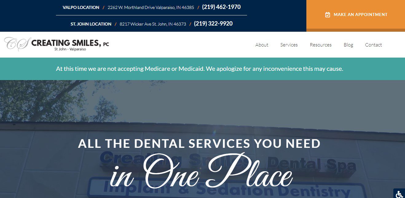
Creating Smiles, P.C. has just 5 items in its navigation bar, and a bright orange CTA button to draw attention and get people to schedule appointments.
2. It Helps Your Practice Achieve Its Goals
Do you want to schedule more appointments, pull in more patients, sell certain services, or all of the above? Your website needs to be designed to help you accomplish these things. Fewer options and a cleaner, more direct navigation help people focus on their objective for visiting your website and stay on the digital path that leads to your phone number, new patient form, or appointment scheduling button. When more people are able to complete the requirements you give them to make an appointment or purchase a product or service, you’ll be able to get more appointments, patients, and revenue.
3. It Makes Your Website Look Better
Who doesn’t want a good-looking website? Don’t clutter up your navigation bar and pages with block after block of content, links, buttons/tabs, and more. Not only is it overwhelming, but it simply doesn’t look good. A navigation bar that’s easy to use is also easier on the eyes.
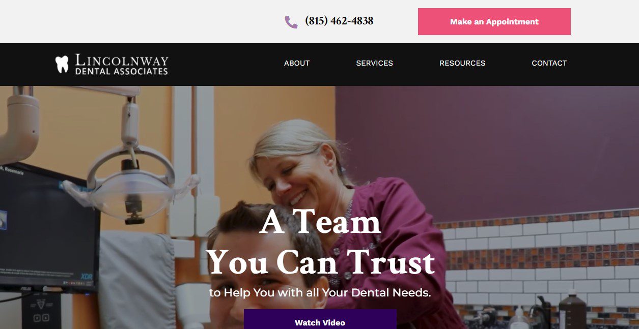
Lincolnway Dental Associates is another example of a clean, simple navigation bar with a boldly colored call-to-action button.
4. It Makes Building Your Website Less of a Headache
Asking for more buttons and other elements on your website can complicate the website design process. It’s time-consuming, not only because there are more things to add, but because it may not all fit in the layout, which might result in more time being spent adjusting the overall page design. What might seem like a simple tweak could have a domino effect on the rest of the page.
Best Practices for a Better User Experience on Your Website
Your website is a tool. When people land on it, you want them to carry out certain actions. But how do you get them to do what you want them to do?
Here are some of our best practices for designing an easily navigable website:
- Use unique, contrasting colors for call-to-action buttons
- Limit the number of call-to-action buttons you have in the header of your website. Usually, it’s best to have just one (make an appointment, call now, etc.)
- Place calls-to-action in plain view, with adequate space around them so they don’t get lost in the clutter
- User data should inform your decision-making in the layout and design of your website; if no one is visiting a page on your website, it could be that the path to get to that page is not as clear as it should be
- Allow people to navigate your website by using your navigation bar as much as possible. This builds the precedent to use the navigation to get around the website. We typically organize the navigation bar into 3 simple categories:
- About – Any pages that involve information about your practice, including the team page, practice tour, community involvement, etc.
- Services – This tab houses all of the pages that talk about your services.
- Resources – This includes client resources such as web forms, payment gateways, online stores, etc.
Make the Paradox of Choice a Non-Issue with Stellar Web Design
Your website needs to tell people what they should do when they land on it, and make it as easy as possible for them to carry out the desired actions. If your current website is cluttered, confusing, and counterproductive to your business goals, then you’re probably also inflicting the paradox of choice on your website visitors. At InTouch, we’re proud to have talented website designers and developers in-house who can help you bring your website vision to life. But more than that, they understand what makes for truly exceptional website design, design that gets results for your dental practice. To learn more, call us today at (877) 493-9003.